Code
library(dplyr)
library(tidyverse)
library(readxl)
library(tidyquant)
library(readxl)
library(glue)
library(tidyr)
library(lubridate)
library(ggplot2)
library(plotly)
library(parcoords)library(dplyr)
library(tidyverse)
library(readxl)
library(tidyquant)
library(readxl)
library(glue)
library(tidyr)
library(lubridate)
library(ggplot2)
library(plotly)
library(parcoords)sp500rank <- read_excel("sp500rank.xlsx")
sp500rank_list = unlist(sp500rank['Symbol'])First we would like to show the percentage of investment in a cumulative curve.
sp500rank$CumulativePercent <- cumsum(sp500rank$"Portfolio%")
ggplot(sp500rank, aes(x = Rank, y = CumulativePercent)) +
geom_line() + # Line plot for the cumulative sum
theme_minimal() + # Minimal theme for the plot
labs(title = "Cumulative Portfolio Percentage by Rank",
x = "Rank",
y = "Cumulative Portfolio")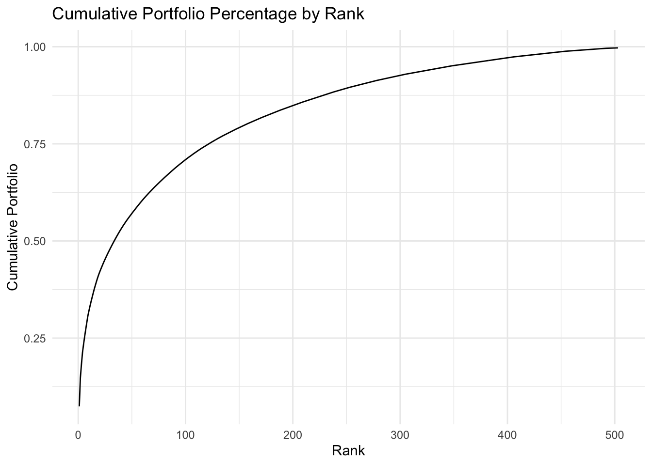
This graph shows that the first few stocks take over 25% of the portfolio, the first 50 stocks take over 50% of the portfolio, and the first 125 stocks take about 75% of the total portfolio.
sp500rank$RankGroup <- replace_na(cut(sp500rank$Rank, breaks=seq(0, max(sp500rank$Rank), by=101), include.lowest=TRUE, labels=FALSE), 5)
ggplot(sp500rank, aes(x = Rank, y = CumulativePercent)) +
geom_line() +
theme_minimal() +
facet_wrap(~RankGroup, scales = "free") +
labs(title = "Cumulative Portfolio Percentage by Rank",
x = "Rank",
y = "Cumulative Portfolio")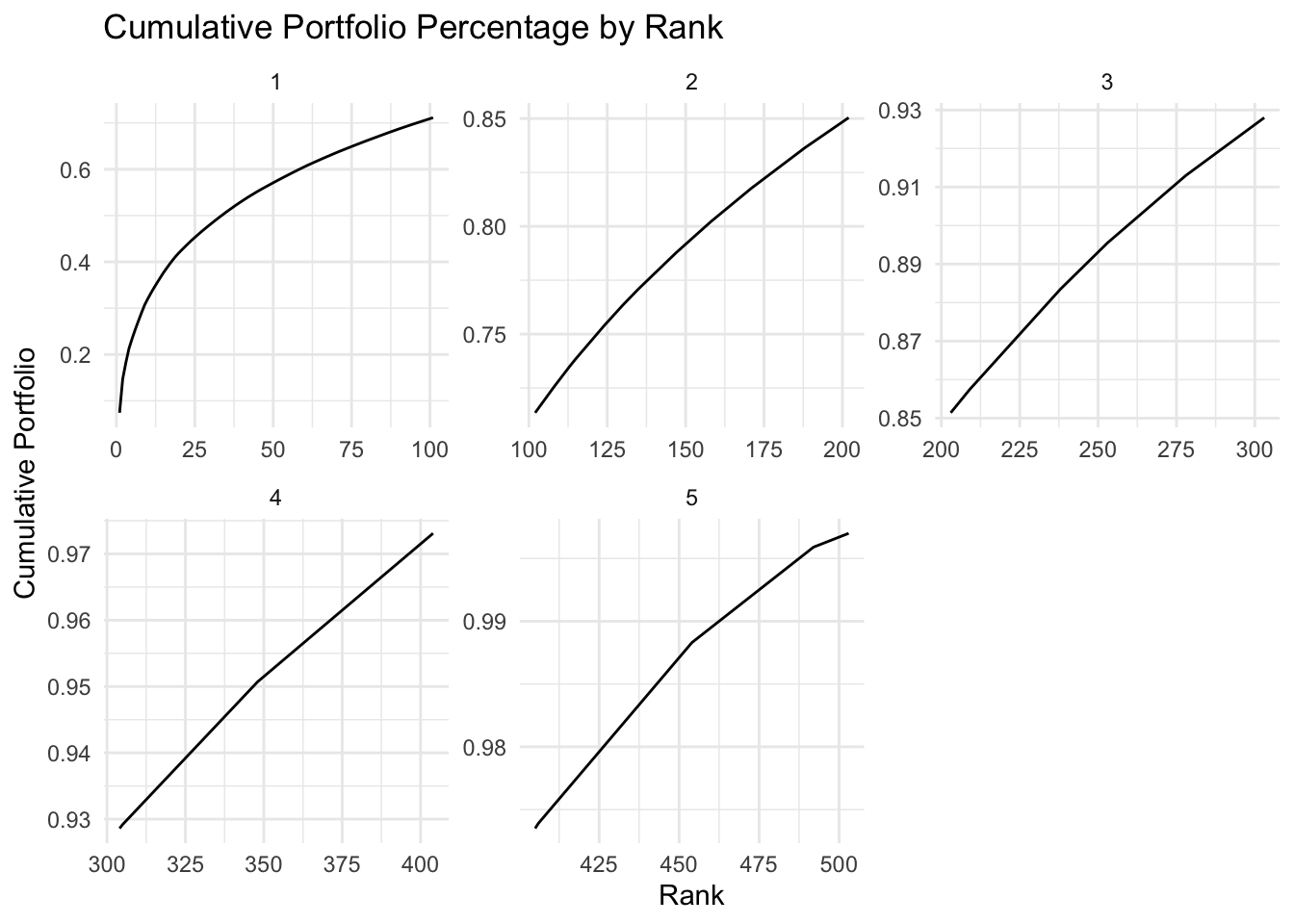
Different from the overall graph, we can see that except for the first 101 stocks, the cumulative lines look more linear with only small mount of curve in the middle. This means that the movement of the top stocks should have significant impact on the movement of the S&P 500 index.
We will now look into the movement of the top stocks and bottom stocks.
top_25_symbols = sp500rank_list[1:25]
last_25_symbols = rev(rev(sp500rank_list)[1:25])
top_25_df = list()
for (stock in top_25_symbols) {
assign(stock, read.csv(glue('data/{stock}.csv')), envir = .GlobalEnv)
top_25_df[[stock]] <- get(stock)
}
top_25_df <- lapply(top_25_df, function(df) {
names(df) <- gsub("^[^.]*\\.", "", names(df))
return(df)
})
top_25_df <- lapply(top_25_df, function(df) {
names(df) <- gsub("^[^.]*\\.", "", names(df))
return(df)
})
bot_25_df = list()
for (stock in last_25_symbols) {
assign(stock, read.csv(glue('data/{stock}.csv')), envir = .GlobalEnv)
bot_25_df[[stock]] <- get(stock)
}
bot_25_df <- lapply(bot_25_df, function(df) {
names(df) <- gsub("^[^.]*\\.", "", names(df))
return(df)
})
combined_top25_df <- bind_rows(top_25_df, .id = 'symbol')
combined_bot25_df <- bind_rows(bot_25_df, .id = 'symbol')
combined_top25_df$Date <- as.Date(combined_top25_df$Index)
combined_bot25_df$Date <- as.Date(combined_bot25_df$Index)Let’s first take a look at the S&P500 movement overt the past 20 years.
sp500 <- read.csv('data/GSPC.csv')
sp500$Date <- as.Date(sp500$Index)
ggplot(sp500, aes(x = Date, y = GSPC.Close)) +
geom_line() +
theme_minimal() +
labs(title = "Closing Price by Date",
x = "Date",
y = "Closing Price") +
theme(axis.text.x = element_text(angle = 90, hjust = 1))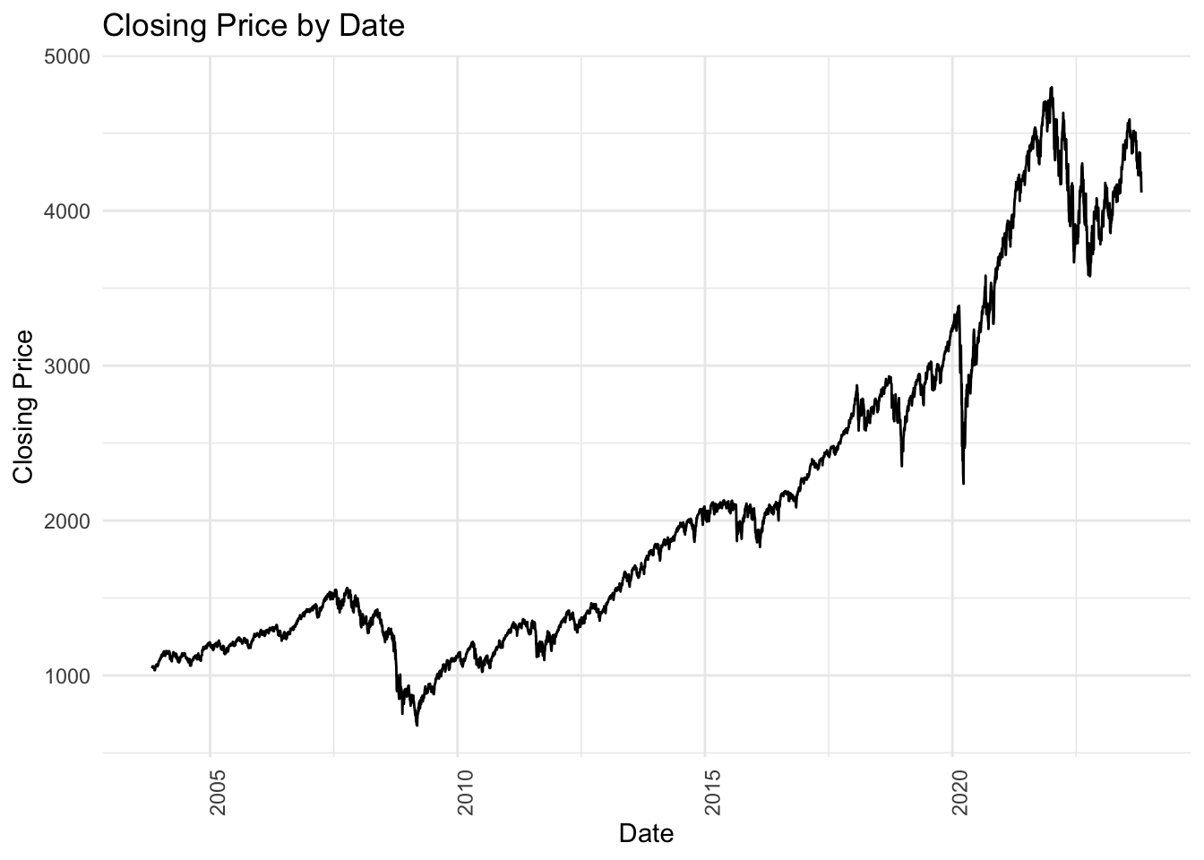
As we can see, it shows a steady growth over the past 20 years.
Now, let’s look at the top 25 stocks form the S&P500.
ggplot(combined_top25_df, aes(x = Date, y = Close, group = symbol)) +
geom_line() +
facet_wrap(~ symbol, scales = "free_y") +
theme_minimal() +
labs(title = "Closing Price by Date",
x = "Date",
y = "Closing Price") +
theme(axis.text.x = element_text(angle = 90, hjust = 1))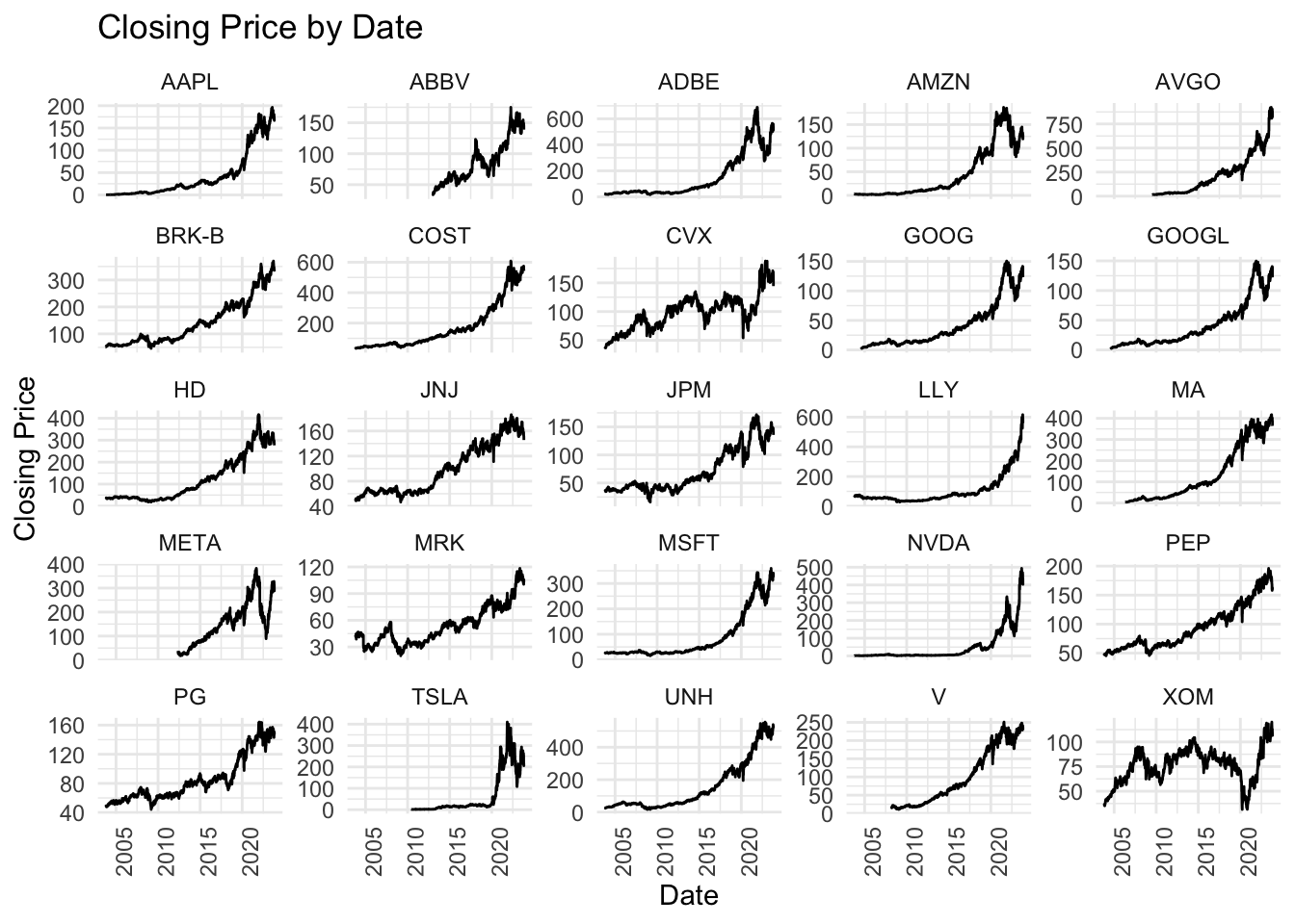
In the plot, most of them show a similar pattern of increase from 2003 to 2023 as S&P500, except for a few stocks including Tesla and Nvidia that didn’t have obvious growth until recent, as well as Exxon Mobil (XOM) and Chevron(CVX) that fluctuated around a certain price for about 15 years without obvious growth pattern.
Then, let’s take a look at the bottom 25 stocks from S&P500.
ggplot(combined_bot25_df, aes(x = Date, y = Close, group = symbol)) +
geom_line() +
facet_wrap(~ symbol, scales = "free_y") +
theme_minimal() +
labs(title = "Closing Price by Date",
x = "Date",
y = "Closing Price") +
theme(axis.text.x = element_text(angle = 90, hjust = 1))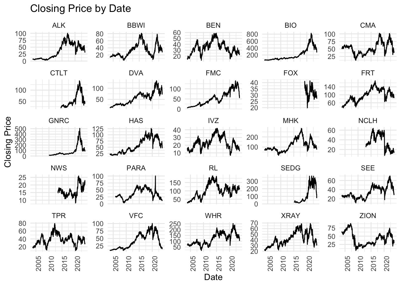
This looks more interesting than the last graph, because now we see many different patterns where almost none of them look close to the S&P500 movement. For example, Zions Bancorporation (ZION) started at its historical high price and then had a big price drop. Bio-Rad Laboratories(BIO), CapitaLand China Trust(CL), and Generac Holdings(GNRC) all show a similar pattern, all had a sudden peak between 2021-2022, and all soon dropped back to the price before peak. This raise our further interest to explore the next batch of stocks after the top 25 ones - will they look more like the s&p500 pattern? or will they look more like the last 25 stocks?
next_25_symbols = sp500rank_list[26:50]
next_25_df = list()
for (stock in next_25_symbols) {
assign(stock, read.csv(glue('data/{stock}.csv')), envir = .GlobalEnv)
next_25_df[[stock]] <- get(stock)
}
next_25_df <- lapply(next_25_df, function(df) {
names(df) <- gsub("^[^.]*\\.", "", names(df))
return(df)
})
next_25_df <- lapply(next_25_df, function(df) {
names(df) <- gsub("^[^.]*\\.", "", names(df))
return(df)
})
combined_next25_df <- bind_rows(next_25_df, .id = 'symbol')
combined_next25_df$Date <- as.Date(combined_next25_df$Index)ggplot(combined_next25_df, aes(x = Date, y = Close, group = symbol)) +
geom_line() +
facet_wrap(~ symbol, scales = "free_y") +
theme_minimal() +
labs(title = "Closing Price by Date",
x = "Date",
y = "Closing Price") +
theme(axis.text.x = element_text(angle = 90, hjust = 1))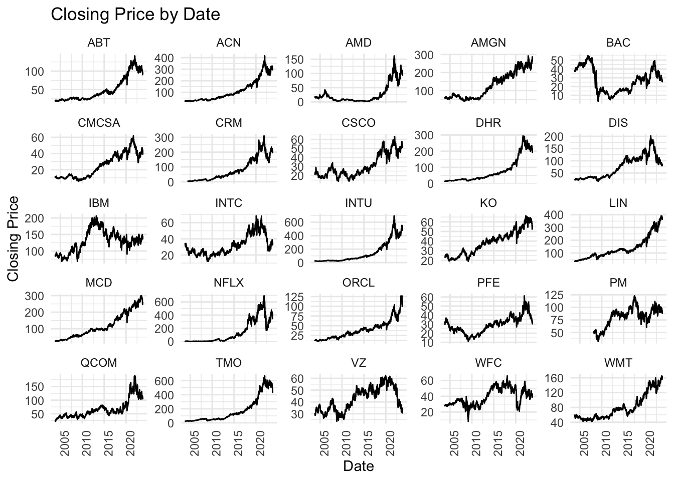
The stocks in this plot show somewhat closer to our first batch as most of them have a steady growth over the past 20 years, which is closer to the S&P500 curve. However, we can observe that in both this plot and the bottom 25 stocks plot, there are many stocks that showed steady increase until recent years, and then kept going down until now, including ABT, ACN, AMD, CMCSA, CRM, and so on… Their drops in price are somewhat larger than the S&P500 index, which shows the resiliency of the S&P500 to price change.
Next, after seeing the overall trend, we would like to explore the yearly price change of the individual stocks for recent years.
yearly_prices <- combined_top25_df %>%
mutate(Year = year(Date)) %>%
group_by(symbol, Year) %>%
summarize(YearStart = first(Close),
YearEnd = last(Close),
PriceChange = (YearEnd - YearStart) / YearStart * 100) %>%
ungroup()`summarise()` has grouped output by 'symbol'. You can override using the
`.groups` argument.filtered_data <- yearly_prices %>%
filter(Year >= 2014, Year <= 2022)
ggplot(filtered_data, aes(x = symbol, y = PriceChange, fill = symbol)) +
geom_bar(stat = "identity") +
facet_wrap(~ Year, scales = "free_x") +
theme_minimal() +
labs(title = "Annual Price Change of Stocks",
x = "Stock Symbol",
y = "Price Change (%)") +
coord_flip() +
theme(axis.text.x = element_text(angle = 90, hjust = 1),
legend.position = "none")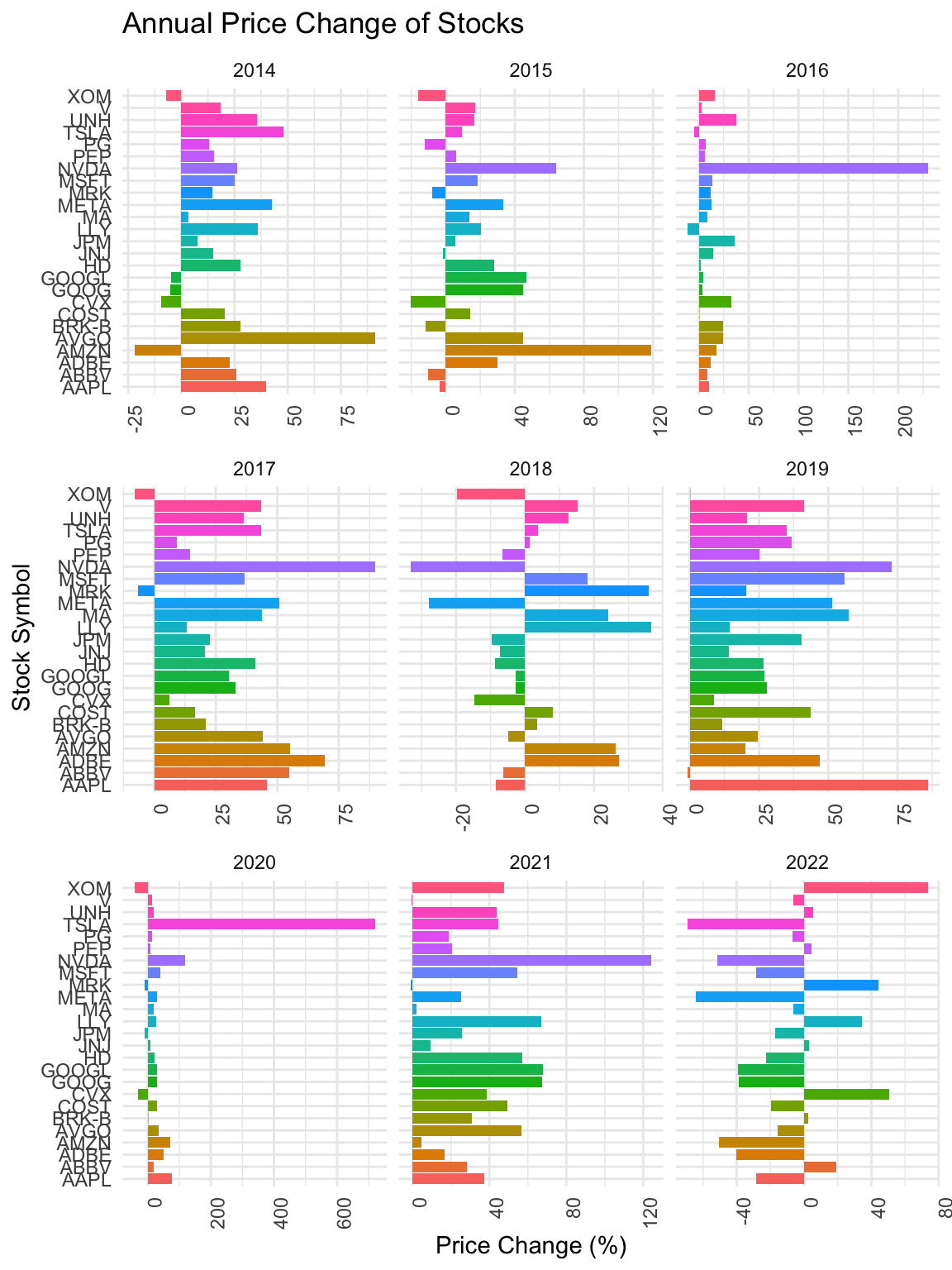
We can see that in 2018 and 2022, the movement of prices are very different across stocks. While in other years, the overall directions of the change in price were similar, the directions of change in price of individual stocks varied a lot in 2018 and 2022.
yearly_prices <- combined_next25_df %>%
mutate(Year = year(Date)) %>%
group_by(symbol, Year) %>%
summarize(YearStart = first(Close),
YearEnd = last(Close),
PriceChange = (YearEnd - YearStart) / YearStart * 100) %>%
ungroup()`summarise()` has grouped output by 'symbol'. You can override using the
`.groups` argument.filtered_data <- yearly_prices %>%
filter(Year >= 2014, Year <= 2022)
ggplot(filtered_data, aes(x = symbol, y = PriceChange, fill = symbol)) +
geom_bar(stat = "identity") +
facet_wrap(~ Year, scales = "free_x") +
theme_minimal() +
labs(title = "Annual Price Change of Stocks",
x = "Stock Symbol",
y = "Price Change (%)") +
coord_flip() +
theme(axis.text.x = element_text(angle = 90, hjust = 1),
legend.position = "none")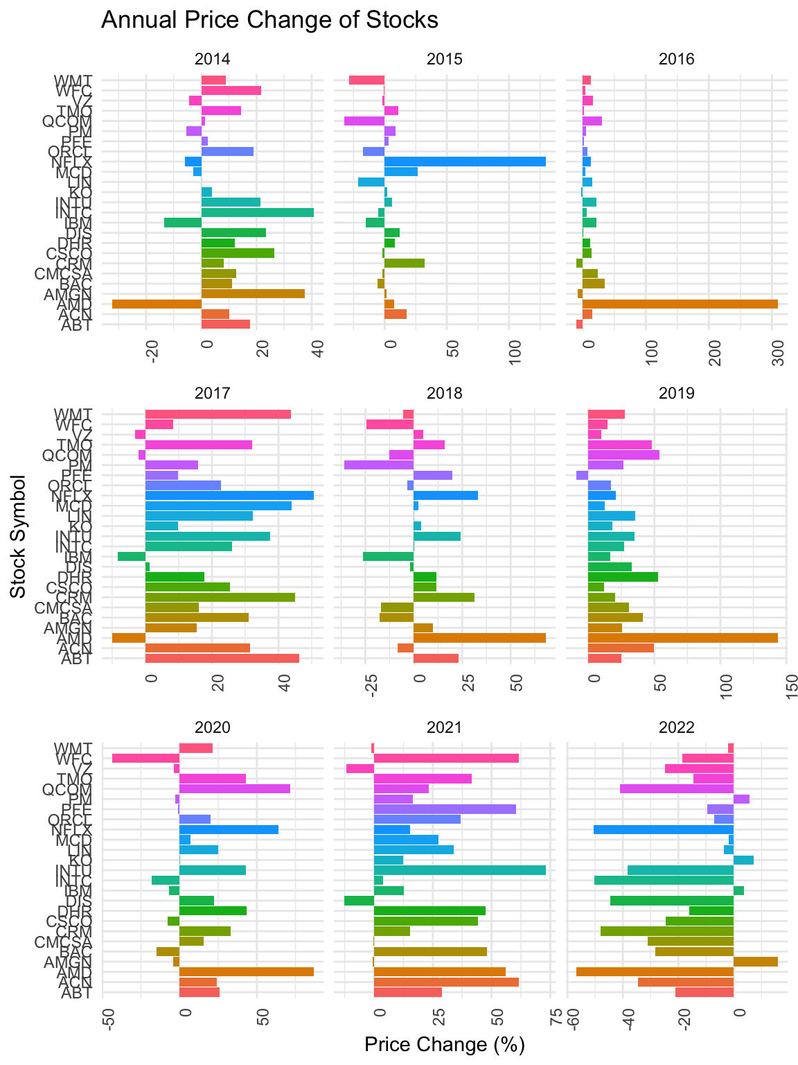
When we look at the next batch, in 2015, they also show variations in directions of change of price. One interesting finding is that AMD during many years moved against the overall direction of change of price. For example, during 2014, while most stocks showed increase in prices, AMD had a large drop in price. However, in 2016, while other stocks did not have great change in price, the price of AMD’s stock increased by over 300%.
Seeing such large variation in stock prices, we would like to further dig in by looking at different sectors.
sectors <- read.csv("data/sectors.csv")
stock_prices = read.csv("data/stocks2year.csv")
stock_prices$sector = ""
for (i in (1: 499)){
s = stock_prices[i,]$symbol
sec = ifelse(length(sectors[sectors$Symbol==s,])==0,NA,sectors[sectors$Symbol==s,]$Sector)
stock_prices[i,]$sector = sec
}g <- stock_prices[stock_prices$symbol!="CMG" & stock_prices$symbol!="AZO",] |> drop_na() |> ggplot(aes(x = close, y=close2, color=sector,text=symbol)) +
geom_point(size=1) +
stat_function(fun = function(x) x, color = "black") +
stat_function(fun = function(x) 0.8 * x, color = "black") +
stat_function(fun = function(x) 1.2 * x, color = "black")
ggplotly(g)3 lines are drawn to mark the 20% return, 0% return and -20% return. By double click on individual sectors, We can see that energy companies were doing great for the last 2 years with over 20% return, while telecommunications services were not doing well and a large number of financial companies were losing value.
stock_prices$return <- stock_prices$close2/stock_prices$close - 1
stock_prices$performance <- cut(stock_prices$return, breaks = c(-10,-0.2,0,0.2,10), labels=c('less than -20%', '-20 to 0 %', '0 to 20 %', 'over 20%'))
stock_prices|> drop_na() |> ggplot(aes(y = sector)) + geom_bar(fill="cornflowerblue") + facet_wrap(~performance)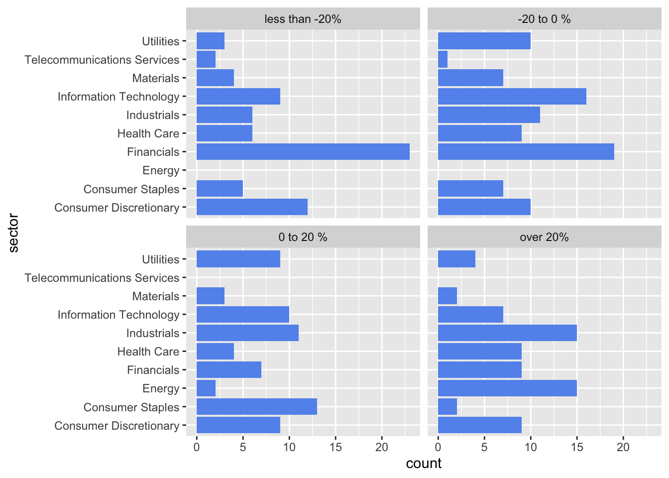
The performance of consumer discretionary sector seems to be evenly distributed over four categories. It is rare for consumer staples sector and materials sector companies to have more than 20% growth over 2 years.
APR21 = read.csv("daily-treasury-rates-2021.csv")
APR22 = read.csv("daily-treasury-rates-2022.csv")
APR23 = read.csv("daily-treasury-rates-2023.csv")
APR = bind_rows(APR21,APR22,APR23)
head(APR) Date X1.Mo X2.Mo X3.Mo X6.Mo X1.Yr X2.Yr X3.Yr X5.Yr X7.Yr X10.Yr
1 12/31/2021 0.06 0.05 0.06 0.19 0.39 0.73 0.97 1.26 1.44 1.52
2 12/30/2021 0.06 0.06 0.05 0.19 0.38 0.73 0.98 1.27 1.44 1.52
3 12/29/2021 0.01 0.02 0.05 0.19 0.38 0.75 0.99 1.29 1.47 1.55
4 12/28/2021 0.03 0.04 0.06 0.20 0.39 0.74 0.99 1.27 1.41 1.49
5 12/27/2021 0.04 0.05 0.06 0.21 0.33 0.76 0.98 1.26 1.41 1.48
6 12/23/2021 0.04 0.05 0.07 0.18 0.31 0.71 0.97 1.25 1.42 1.50
X20.Yr X30.Yr X4.Mo
1 1.94 1.90 NA
2 1.97 1.93 NA
3 2.00 1.96 NA
4 1.94 1.90 NA
5 1.92 1.88 NA
6 1.94 1.91 NAunemployment = read.csv("data/unemployment.csv")
sp500 = read.csv("data/sp500.csv")
sp500 <- sp500 |> mutate(Date = as.Date(Date, format = "%Y/%m/%d"))
df <- APR[c(1,4,6,11)]
df <- df |> mutate(Date = as.Date(Date, format = "%m/%d/%Y"))
unemployment <- unemployment |> mutate(date = as.Date(date, format = "%Y/%m/%d"))
unemployment$date = format(unemployment$date, "%m/%Y")
df$Date = format(df$Date, "%m/%Y")
sp500$Date = format(sp500$Date, "%m/%Y")
sp500$Close = readr::parse_number(sp500$Close)
unemployment$X3.Mo = NA
unemployment$X1.Yr = NA
unemployment$X10.Yr = NA
unemployment$price = NA
s1 <- df|>group_by(Date)|>summarise(rate=mean(X3.Mo))
s2 <- df|>group_by(Date)|>summarise(rate=mean(X1.Yr))
s3 <- df|>group_by(Date)|>summarise(rate=mean(X10.Yr))
s4 <- sp500|>group_by(Date)|>summarise(rate=mean(Close))
for (i in (1: 35)){
d = unemployment[i,]$date
print(d)
unemployment[i,]$X3.Mo = s1[s1$Date==d,]$rate
unemployment[i,]$X1.Yr = s2[s2$Date==d,]$rate
unemployment[i,]$X10.Yr = s3[s3$Date==d,]$rate
unemployment[i,]$price = s4[s4$Date==d,]$rate
}[1] "01/2021"
[1] "02/2021"
[1] "03/2021"
[1] "04/2021"
[1] "05/2021"
[1] "06/2021"
[1] "07/2021"
[1] "08/2021"
[1] "09/2021"
[1] "10/2021"
[1] "11/2021"
[1] "12/2021"
[1] "01/2022"
[1] "02/2022"
[1] "03/2022"
[1] "04/2022"
[1] "05/2022"
[1] "06/2022"
[1] "07/2022"
[1] "08/2022"
[1] "09/2022"
[1] "10/2022"
[1] "11/2022"
[1] "12/2022"
[1] "01/2023"
[1] "02/2023"
[1] "03/2023"
[1] "04/2023"
[1] "05/2023"
[1] "06/2023"
[1] "07/2023"
[1] "08/2023"
[1] "09/2023"
[1] "10/2023"
[1] "11/2023"#unemployment |> drop_na() |> GGally::ggparcoord(columns=c(6,3,2,5), alpha = 0.3)
parcoords::parcoords(
unemployment[c(3,2,6,5)],
rownames = F
, brushMode = "1D-axes"
, reorderable = T
, queue = T
)We can see that employment rate and interest rate are negatively correlated; Extreme values (too high or too low) of unemployment rate often occurred with low sp500 index while sp500 peaks at low unemployment rates.
stock_prices = read.csv("data/stocksCovid.csv")
stock_prices$sector = ""
for (i in (1: 496)){
s = stock_prices[i,]$symbol
sec = ifelse(length(sectors[sectors$Symbol==s,])==0,NA,sectors[sectors$Symbol==s,]$Sector)
stock_prices[i,]$sector = sec
}
stock_prices$resilience = (stock_prices$close3-stock_prices$close2)/(stock_prices$close - stock_prices$close2)
g <- stock_prices |> drop_na() |> ggplot(aes(x = close, y=close2, color=sector,text=symbol)) +
geom_point(size=1) +
stat_function(fun = function(x) x, color = "black")
ggplotly(g)#write.csv(stock_prices2, "stocks2year.csv", row.names = FALSE)Price of stocks of all sectors dropped a lot in the first few months of Covid. While a few of them stay stationary(no increase not decrease).
stock_prices[stock_prices$resilience < 2 & stock_prices$resilience > 0,] |> drop_na() |> ggplot(aes(y=resilience)) + geom_histogram() + facet_wrap(~sector)`stat_bin()` using `bins = 30`. Pick better value with `binwidth`.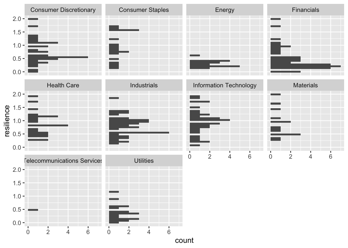
The utilities sector and energy sector had a very hard time recovering from the pandemic, while the financial sector recovers relatively slowly. The information technology sector appears to be the most resilient from the pandemic.
A significant portion of the S&P 500’s value is concentrated in its top stocks. This concentration illustrates the impact that movements in these top stocks can have on the overall index. The first 50 stocks account for over 50% of the portfolio’s value, highlighting the index’s skewed distribution towards larger companies. There’s a clear distinction in performance patterns between the top and bottom stocks of the S&P 500. The top stocks generally mirror the S&P 500’s overall upward trend, while the bottom stocks exhibit more varied and often divergent patterns. This diversity in performance indicates different market dynamics at play across the spectrum of the S&P 500. Sector-specific analysis reveals differing fortunes over the years. For instance, energy companies showed strong returns recently, while financial and telecommunications services sectors struggled. This indicates the varying impact of economic and market conditions on different sectors. ## Limitations and Lessons learned The variation in yearly price change among individual stocks, particularly in 2018 and 2022, demonstrates the variation within the index. Some stocks, like AMD, show counter-cyclical price movements, suggesting unique factors at play for certain companies or sectors. Factors like global economic conditions, regulatory changes, and technological advancements, which can significantly impact stock prices, are not directly accounted for in this analysis. While we tried our best, interpretation of data, especially when looking at sectors or individual stocks, can be subjective and may require deeper investigation to draw concrete conclusions. Conclusion ## Conclusion In conclusion, this visualiztion of the S&P 500 underscores the complexity and diversity within the index. The influence of top stocks on the overall index movement, the similar movement of top stocks, other distinctive patterns of stock performance, and the sector-specific responses to economic conditions collectively paint a multifaceted picture of the market. This study highlights the possibility and important of a visualization approach to understanding stock market dynamics.